If you’ve been hanging around this blog for any length of time, you know that yours truly has a thing for space pirates—especially space pirate heroines. I’m eagerly anticipating Susan Grant’s forthcoming science fiction romance SUREBLOOD, the next book in her Borderlands series. Why? Because it’s going to feature a space pirate heroine! (Oh, yeah, and the hero’s a pirate, too.) Naturally, such elements imply loads of gritty adventures, space battles, and a fiery romance.
So one would think the cover of such an SFR should entice the reader with all of that excitement, right? I even blogged about which elements would make a really cool cover for this book in Can This Harlequin Cover Be Saved?. Well, if you responded “yes,” then think again. The art & marketing department of romance publisher Harlequin has other plans for SUREBLOOD’s cover.
And hoo boy, you may want to cover your eyes:
My very first reaction: Whoa, the guy looks like he just stepped out of the shower. This is a clean, professional looking cover…for deodorant/cologne/soap packaging.
In short, this proposed cover for SUREBLOOD is definitely a Cover Fail. It made me wonder what kind of alternate universe did the art and marketing department staffers inhabit. One without space pirate stories? The cover may be professional, but in my opinion, it’s totally bland—especially given the book’s action adventure content. Can you say massive disconnect, boys and girls? I had such high hopes for this cover. Color me disappointed—and mightily frustrated.
Where are the space pirates promised by the jacket copy? The cover conveys erotic romance to me. I recall that author Linnea Sinclair had a similar issue with the initial mock-ups for her new covers—they screamed erotic romance. Which is all well and fine if the story is an erotic romance. (Even then, plenty of digital publishers releasing erotic SFR manage to insert at least one science fictional element, so kudos to them.) All the more, I’m convinced that regarding SFR, Man Titty Does Not Compute.
Perhaps it’s a sign of these difficult economic times that romance publishers are ratcheting up the man titty/erotic romance campaigns. Seems like in order to capture as many sales as possible, they are attempting to appeal to every single romance reader regardless of individual taste (but all readers swoon for man titty cover? Really?). In the end, they will end up pleasing a number that in my totally biased opinion will fall short of potential.
Sexy and romantic covers? Great, awesome—why not a clinch cover for SUREBLOOD, with a starry background, perhaps? A fiercely accessorized, sexy space heroine with generous cleavage would be a great draw for male readers. Why do historical romances get clear historical visual cues and books like these don’t? Ghettoization of SFR? Yes, in part, along with the corporate mentality that dictates standardization of art.
Is this cover fiasco another indication that romance publishers think their female readers are idiots when it comes to science fiction romance? Maybe Harlequin thinks the stories are both too science fictional and too exotic for readers to enjoy. Gah. I want to believe it’s more of a profit issue, namely, the need for a book cover to have wide appeal.
But clearly, this cover indicates the Harlequin art/marketing department has no faith in the book itself to drive sales, or in the core fan base that would drive the buzz. They simply don’t want readers to know what lieth between the covers. They have your money, so why should they care?
Did you hear the one about DC Comics? Once upon a time, the publishing suits decided that they would commission artists to drum up fetching covers...first. Later, they would then direct the writers to craft a story based (loosely or not) on the cover, which the powers-at-be had deemed worthy enough to attract higher sales. See the cover below from 1977? This one of these, drawn by comics extraordinaire Neal Adams. 
Kryptonite implanted in Superman’s body? He’s going to die but kill somebody first?? Where do I sign up?? It is an eye-catching cover, especially if you’re a 12-year-old boy (the intended audience at the time). But, the story inside doesn’t even come close to measuring up to this dramatic scene. If fact, it hardly even references it. Even those 12-year-olds recognized they had been conned, as seen in some angry letters to the editor a few issues later.
This raises an important question: what exactly are publishers trying to sell to readers? Is just all about the cover? When did the story become such an afterthought? When did it become such an invisible commodity?
Another underlying reason for such a bait-and-switch tactic may be the one that no one wants to admit: poorly-performing books. Or—*shuddering at the thought*—poor quality science fiction romance. Has Harlequin been burned so badly by one of its past SFR books that they are now 100% risk-averse when it comes to future books? Are authors like Susan Grant paying the erotic romance cover price because Harlequin miscalculated in the past?
Well, they’re miscalculating for sure when it comes to author branding. Take a look at the cover for Susan Grant’s WARLORD’S DAUGHTER, the previous book in her Borderlands series:
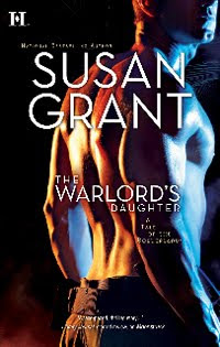
To me, the cover for SUREBLOOD creates a serious disconnect between it and the previous cover. I thought making series covers related was Publishing 101. Or maybe I missed the memo, the one that declared, Sell Readers On The Current Cover Trend Like It’s Going Out Of Style.
Seeing the proposed cover of SUREBLOOD made me recall author Jess Granger’s observation that she shared in the discussion following Can This Harlequin Cover Be Saved?: “SFR does need its own "cover code."” To me, this translates to covers that balance the science fiction and romance elements—or at least placing one SF element in the dang image!
Publishers have to keep taking risks. It’s part of the business. Not a fun one, I’m sure, but this is art we’re talking about, and you can only commercialize it so far before readers start standing in revolt.
What do you think about the proposed cover for SUREBLOOD? Is it the type of cover you’ve come to expect for an SFR story? Would this cover compel you to part with your hard earned cash (or dig into your savings) without knowing anything else about the story?
Share your observations here, or contact Harlequin with your feedback by sending an email to customer_ecare “at” harlequin.caJoyfully Sullenly yours,
Heather
Tuesday, December 15, 2009
The Science Fiction Romance That Harlequin Doesn’t Want You To Know About
Subscribe to:
Post Comments (Atom)


52 comments:
I think it might be more a Harlequin style thing. Go to the Luna imprint and look at the new covers for PC Cast's Divine series, which is a fantasy series.
Ohmigoodness, I just had such a publicity idea. Anyone an artist?
I have the new cover art too. Uh, hmm. Groan. Poor Susan.
But, like I said, I just had such a publicity idea. Anyone an artist?
Not digging the Harlequin cover. Makes me think he's some strange alien life form. Not sexy at all. Why not take a page from the urban fantasy covers and place a woman with a big gun on the ship's deck?
Covers for romance books (sci fi or otherwise) are given covers that will "sell" the book not represent it.
One thing I love about epublishing is that I do have input. The results may not be what I always envision, but they do take my opinion and my pictures into account.
In NY, HQN is all about marketing. If the cover catches the eye and gets someone to read the blurb, then it has done its job, in their opinion.
I'd love to see some spectacular sci fi covers for SFR, but I'm not holding my breath.
Interesting title for the post, by the way, and very appropriate.
Here we are doing all we can to help out in the blogosphere and sometimes it feels like the publishers are working against us. Do they pay any attention to our suggestions at all or do they just make their best guesses based on mere sales numbers?
Anyway, I'm here for Susan, so she can keep writing the books I love.
The cover is sadly lacking any space pirate punch, and really, why wouldn't they (the publisher) play that up like gangbusters? I find myself drawn to hand-illustrated covers nowadays, like SPELLBENT or Ann Aguirre's Sirantha Jax series. Think of what they could do for Ms. Grant's novel with that kind of cover, BUT they'd have to pay an artist. I think too often they just want to photoshop a stock photo and kick the book out the door. It's a crying shame.
That cover might be vaguely sci-fi (with its sterile THX 1138 lighting) if they'd give the poor guy ANYTHING futuristic to hold or wear. A laser gun. A pirate eyepatch and robo-parrot. An alien tattoo.
Maybe Harlequin are that cheap.
A bookstore browser might pick this up, but instead of "Which planet are you from?" they'd be asking "Which shelf are you from?"
But I guess Calvin Klein gotta eat.
Awful cover.
It reminds me of a cover I received for one of my recent sci-fi books. Despite there being a love story of sorts, I stressed it was NOT a romance. It was a futuristic war story featuring an integrated armed forces. Think Starship Troopers. Well the artwork she sent me had the soldier heroine dressed in leather dominatrix gear and looking like Pamela Anderson in Barb Wire. I asked what that had to do with the military and the artist replied, "She's hot. This will sell better."
I told her I liked her new book Hookers on the Front Line and could she please take me name off it. We worked it out in the end--she had to redo the cover a further three times--but I'll always keep hold of that first draft she sent me...
When I got to be Larry Flynt for a day.
And the saddest part is--her cover probably WOULD have sold more copies.
@Angela Thanks for commenting (especially with your busy schedule o_O). Good point, but I feel compelled to point out that I recently saw the cover for Susan Kyle's (aka Diana Palmer) THE MORCAI BATTALION: THE RECRUIT. That's more along the lines of a cover I was hoping to see for SUREBLOOD. Granted, TMB: TR is probably not a traditional romance, but the first book in the series has romantic elements so I'm betting the second will, too.
I know there are imprint differences, but since the content of both books are science fiction/science fiction romance, and both are from Harlequin, I'm not seeing why there's such a drastic difference in covers. I want to have my cake and eat it, too!
Kimber An, let me tell you, if anyone sends me a good mock up of an alternate cover for SUREBLOOD I'd post it in a second. Let the SFR community have a vote!
Makes me think he's some strange alien life form.
A squeaky clean alien life form at that.
@Jennifer You bring up absolutely valid points. I'm still going to complain about the cover, though, lol! Upon further reflection, I realized that one reason having a representative cover is so important to me is that I grew up watching so many SF/SFR films and shows. I'm used to the visuals, I love the visuals, so I don't expect that to change just because a romance publisher is releasing the product.
With franchises like Star Wars and Star Trek being so popular, why wouldn't publishers want to tap into that for their covers, even just a fraction?
@Rebecca It’s a cost thing, definitely, and mainstream print publishers are increasingly relying on stock images these days. Even so, there is a lot one can do with stock images. I’m not expecting an illustrated cover, although that would be fabulous, but a little creativity with stock images goes a long way.
@Robert Yes, even a cool looking futuristic tattoo would work. Something to hint at the exotic nature of the story. But they need to lose the towel, or make the top of whatever he’s wearing black. Because space pirates are bad-ass bad boys and they look hot in black.
Princess Leia would never have called him a scruffy-looking nerfherder either. She may have said she liked nice men, but she made three babies with a nerfherder.
If I didn't know what Susan Grant wrote (for the most part) and I saw the SUREBLOOD cover, I'd think it was yet another pretty boy vampire romance. Which, I'm sorry, I don't read. I'd pass it right by. (space pirates =/= pretty boys, IMO)
As for THE WARLORD'S DAUGHTER, um...where does the "daughter" part come in? Is she hiding behind blue chest guy? And is *that* the only hint we have that it's SFR? Blue light?
Yeah, a bit more of a hint of the SF content would have been nice. Come on Harlequin, give your authors and the readers some credit here : P
I agree with Katiebabs idea! Why do some genres get it so right with covers and others so wrong. I think the covers shown are rubbish even it is was for erotic fiction. I love science Fiction and I would honestly think this book was in the wrong section of the store and by pass it. Covers are important for the sale of the book to readers who are new to the genre or author. Shame that publishers just don't see this.
I DON'T LIKE the proposed cover of Sureblood. Certainly doesn't give the impression that the book's a SFR. I WILL buy the book, though, simply because it's written by Susan Grant. ;) Can't wait to meet Valeeya Blue and Dake Sureblood.
Is there data to support the idea that mainstream romance readers will pick up a SFR if the cover has a bare male chest? They won't put it down after reading the blurb?
My impression is that SFR readers are mostly SF fans. Am I off?
My corner of internet fandom really likes the Tenth Doctor's suit. Hair too. Nice hair and a suit can go a long way.
I like the cover of Linnea Sinclair's upcoming book. Starbuck and a nerdy clothed guy! w00t!
If I were browsing this cover in a bookstore, I'd unfortunately look at it and think, "Hmm, jock in a shower. Not in the mood for a contemp." and drift over to the SF section. Sadly. How terrible is it that our cover shorthand language is so cave-like?
I second the above poster who said we need a cover shorthand for SFR. I admit it, I think the starfield background is getting kinda cheddary, but there isn't much else we've got (and in spite of the aged curd, I still asked for it for my first SF-ER release, so it's out there, being cheese).
Meh.
I'm tired of naked male torsos, even on regular romances. I wish publishers had more faith in the stories and their authors.
I don't get why THE WARLORD'S DAUGHTER doesn't have, yanno, THE WARLORD'S DAUGHTER on the cover. Doesn't make any sense to me.
I don't agree with it, but I suspect that Harlequin is trying to pull in Romance readers who don't normally read Science Fiction with this new cover for Susan's SUREBLOOD. This tactic will misfire because the expectations won't be inline with the cover.
I love love love the cover of THE MORCAI BATTALION. It's a great melding of both worlds.
Jim Hines makes some points about his supposed "girly books" that seem apropos here as well: http://jimhines.livejournal.com/480974.html
This raises an important question: what exactly are publishers trying to sell to readers? Is just all about the cover? When did the story become such an afterthought? When did it become such an invisible commodity?
Uh, probably with the very first paperback novels way back in the early decades. It is odd, though, when a relatively established author gets treated this way.
And, hey, I wasn't even going to comment on this one but you dragged me in with the Superman cover. :D
It's a good thing Susan's name is REALLY big on the cover. It's the only way anyone will know there's a great story inside.
io9 has picked up the story: Book Covers That Are Ashamed to Be Science Fiction
And, hey, I wasn't even going to comment on this one but you dragged me in with the Superman cover. :D
Scooore! It's a beaut, eh? But it also reminded me that in this age of multi-media entertainment venues, publishers could try and capture the attention of readers who also grew up with blockbuster genre films, video games, and manga.
I just learned that Marjorie M. Liu's TIGER EYE is going to be made into a romance casual game. Made me wonder (not for the first time) how we can take SFR in a similar direction. The covers could be part of an overall package of entertainment--whatever that entails.
Is there data to support the idea that mainstream romance readers will pick up a SFR if the cover has a bare male chest? They won't put it down after reading the blurb?
I was wondering that myself.
Lisa, thanks for the link to the Jim Hines piece.
Keeping in mind that I know absolutely not one thing about Harlequin's cover art process or the thinking behind it, and that any opinions I pose don't represent that of Harlequin but are solely my own...
If you look at books from other publishers, such as Lauren Dane's futuristics from Berkley, I think you'll see that it's not completely unusual to keep things like sci fi elements off a cover. I have a theory about this (which is pure conjecture on my part). And a rather sad statement. First the sad statement: despite the impassioned defense and promotion of SFR on places like this blog, and despite all of us posting here who clearly love SFR, SFR isn't a huge genre, and it doesn't always sell well when promoted strictly as SFR. There are many, many romance readers who have preconceived notions of books with SF elements (kind of like readers who have preconceived notions of romance, ironically enough) and so won't pick up a book that hints at futuristic/SFR/fantasy.
So my theory--again, pure conjecture--is that the marketing departments at publishers have realized this and want the readers to pick the books up and give them a try (of course, because everyone's end game is to sell books) so the first step in getting the reader to simply pluck the book off the shelf, or look past the cover to read the blurb, is to make the cover maybe a little sexy, not screaming of SFR. In other words, the marketing department isn't trying to hurt her sales with SFR readers, but boost them with everyone else.
Of course, it's a Catch-22 because then you run the risk of not capturing the audience (like those here) who do like the genre and would seek it out, but dislike the more romance-centric covers. You have to balance what will net you more sales in the end, and it's a very, very delicate balancing act, sure to enrage some people who see it as a discourtesy to the author/genre, while bringing other fans to the book. I think these discussions often proceed forward as if deciding on marketing for a book, or cover for a book, is made easily or on a whim, and that is most definitely not the case!
I just learned that Marjorie M. Liu's TIGER EYE is going to be made into a romance casual game. Made me wonder (not for the first time) how we can take SFR in a similar direction. The covers could be part of an overall package of entertainment--whatever that entails.
Funny you should mention this. Did you see my post yesterday about the Harlequin Presents game on Big Fish Games? (http://bevsbooks.com/notes/?p=490)
Granted it's only a hidden object game but still... they've tied in a ebook givaway as part of the promo. Plus the article(s) I've seen about it isn't bad press for Harlequin. These people are definitely out to make money.
Is there data to support the idea that mainstream romance readers will pick up a SFR if the cover has a bare male chest? They won't put it down after reading the blurb?
That is a very good question that I don't believe has a straight-forward answer. It all depends upon how the book is distributed, not simply marketed. What I mean is that many times with romances we're potentially talking about subscription sales where the cover doesn't even figure into the purchase.
And that's where it gets tricky to figure out what the heck is going on.
I just wanted to say I love Susan Grant -- I have all her books. Wish the cover was more in the genre though.
I would make the assumption based on the cover alone that this is an erotic contemporary book. But given the author I'd at least pick it up and read the back but probably not immediately could be a while before i was browsing for something and got around to it.
I write futuristics and it's a struggle to find a middle ground when it comes to how "sci fi" a cover should be. I love sci fi covers, but I come from a background where I read Asimov and Herbert years and years before I read romance.
As an author, I face the reluctance of readers to try SFR due in large part to preconceived notions on a regular basis. At the same time, I get letters all the time from readers who never would have picked up my books or other SFR if the covers had been harder sci fi, but who then became converted and have since come to love the genre.
This is why, in large part, I think marketing comes up with covers that are more focused on the characters instead of the genre (and I'd be lying if I said I didn't love my covers, because I do, but they don't scream futuristic at all). I do hope this changes over time because selfishly I hope the genre continues to grow (as a reader and an author).
I think Angela nailed it.
The idea for a cover is to catch the ROMANCE reader and then hook them into buying SFR. Those of us who are LOOKING for SFR aren't thrilled by the cover because it doesn't "look" like SFR. But a romance reader who likes hunka hunka burnin' luv might be intrigued enough to read a SFR.
Luckily, those of us looking for SFR know Susan Grant write what we read.
Huh. To me, it looks more like LitFic than anything else. Very boring. Would totally ignore it if it was an unknown author.
"The idea for a cover is to catch the ROMANCE reader and then hook them into buying SFR."
Pardon me, but that can be taken as a little insulting. It hearkens back and plays into the old stereotype that girls can't and won't do science or science fiction. Even a reader who is not already into SFR will be attracted to a starry background because
*she's looking for something out of this world.*
Vulcans or vampires, whatever, but the
*need is already there.*
The key is finding the right art which says, "Hey, Baby, I got what you want right here."
I still asked for it for my first SF-ER release, so it's out there, being cheese)
See, that's my problem--I love cheese! And starry backgrounds. The code might also depend on the sub-sub genre--steampunk vs. apocalyptic vs. superhuman. Maybe couple + relevant science fictional element?
so won't pick up a book that hints at futuristic/SFR/fantasy.
Which is fine, but what I truly am having difficulty understanding is why they'd read on once the first science fictional element is presented, especially if they are spooked by the same type of elements on the cover. What would change their mind once they started the book?
SFR has a learning curve--not nearly as much as SF but it's still there. I have mixed feelings about the issue. On the one hand, there are definite business considerations. But on the other hand, I'd hate to spring SFR on anyone that isn't even just a little bit interested in the first place. I'd like to see transparency of some kind in the covers, for that reason. Plus, it keeps the hardcore fans happy. :)
I think these discussions often proceed forward as if deciding on marketing for a book, or cover for a book, is made easily or on a whim, and that is most definitely not the case!
Oh, I think the marketing is taken very, very seriously. So seriously that they are banking on such a campaign generating sales with readers who otherwise would have nothing to do with certain sub-genres. They are banking on either the books being good enough to change the minds of these readers and/or the readers adjusting their expectations simply because they had paid for the book. My guess (and I mean this non-sarcastically) is that romance-centric covers are publishers’ way of saying, “Trust us. You’ll like this.”
marketing comes up with covers that are more focused on the characters instead of the genre
Lauren, I think character-driven covers for SFR are terrific—it’s one way to differentiate it from SF. And I love, love romantic SF films that have a clinch image in the poster. Would love to see a similar trend in books, too. My main concern is as stated above, with covers that have zero transparency. I think erotic SFR is a different story and they can go either way. Wouldn’t most readers expect the erotic romance aspect most of all? In other words, they won’t necessarily miss a science fictional element on the cover. I would, but that’s just me.
sales where the cover doesn't even figure into the purchase.
To me, that sounds like a license to put space pirates on every cover, lol! At least those delivered through the subscription service. Kidding!
And I’m heading on over to your post now….
So that's why I like the cover for Linnea's Rebels and Lovers so much:
Bantam did something recently they're not done before: they asked for my specific input on the cover for my next book.
http://aliendjinnromances.blogspot.com/2009/09/rebels-and-lovers-making-of-cover.html
Seriously, I think this cover gets it. I'm anxious to see how it sells.
I had to comment also. I've been reading SF and Romance for decades now and I have to say that my first response was, "Oh, it's a robot book." He's naked and coming out of a small space with a very bright white light streaming behind him, made my think of a futuristic lab. I also have to add that even though Historical Romance has codes built in, the covers can be very messy and inacurate as to what time period they convey as opposed to what time period the book is set in. Most Historicals now are Regencies and so covers show people in Regency dress even if the book is Victorian or Georgian.
My first response in a bookstore, if I didn't know about Susan Grant already, would also be "jock in a shower" and I'd pass it by. My reading time's so limited until my tot goes to school that I'm pretty choosy about genre for the time being.
My first response after reading about the cover was that the publisher was being cheap since one guy and a light isn't as costly as hiring an artist to design a space ship, etc. LOL.
Oops, gotta run. Tot's up now.
Kimber An - I don't think it's insulting at all. I think the point is to promote the darned book and get people to pick it up who wouldn't normally go near the genre and then let the story speak for itself. How is that insulting? The fact is, there are preconceptions about SFR and Futuristics for a great many romance readers - that's what I hear all the time. It's not insulting to have a preference and it's certainly not insulting to hope they pick up something out of their comfort zone and hopefully hook them into a genre they never had considered reading before. That's kind of the point.
Heather - Certainly in any romance novel, readers expect the romance storyline to be central so that's going be the same erotic and non. I can't speak for other authors, but I don't write more sex in my non erotics than in my erotics, I just write the scenes differently.
I don't disagree though, that there SHOULD be elements of the genre in a cover. I want that too, very much. I want it because it's only fair to readers to at least have SOME part of the story telegraphed via that cover. I'm hoping that day comes sooner rather than later.
Heh, I just went to Grant's site and checked out her backlist covers because I'm not currently an active reader of hers. It's true that this new proposed cover isn't consistent with the previous book but check out the similarity in tone to the cover of an anthology she was featured in Mortal in Mysteria http://www.susangrant.com/books/mysteria.htm
Of course, the problem with the cover in question here is that there are very little visual cues to anything in it. Heck, I had to give it a serious second glance just to make sure it was a male featured. It's that blurred of an image. So, I'm not sure I'm completely buying that it's that strong a romance cover either. Particularly not when compared to the one I just linked to which is the most like it I could find in her backlist. At least that other one does have something identifiable in terms of genre.
Other than "maybe" sex.
I'm serious here, people. What exactly is on that cover except a soft focus silhouette that's almost asexual? What is it selling?
It's selling contemporary erotica.
A reader looking for contemporary erotica will pick it up and toss it back. If she buys it and then finds out what it is, she will be mad. And she will vent to all her friends and they will never buy a Susan Grant novel ever again either.
She will not be hooked.
The potential SFR reader, who is already searching for something out of this world, whether Vulcans or vampires, will pass it right by.
Because she's not looking for contemporary erotica.
This is why this blog is so doggone important to SFR readers and authors alike.
Here's an interesting thing: gah! this won't let me post links. - at a reader blog, there's a discussion about one of my books - Undercover - which does not have a futuristic looking cover though it is heroine centric. Anyway, several of the commenters brought up the fact that they usually avoided futuristics but picked the book up based on a sale or author name, etc and found they enjoyed it.
It sounds like I'm being douchey and pointing to my book, but I promise I'm not - it's just an example of what I was talking about in the stream above.
Gonna try to hand code here: http://sleeplessinnreworleans2.blogspot.com/2009/12/undercover-by-lauren-dane.html
@BevBB I see some paranormal and UF elements (tattoo, obscured face in shadow which could signify the presence of a demon/ghost, plus that ties into the mystery connotation of the anthology title). Maybe what's being sold is the fantasy of a relationship/sex with a hawt demon??
Lauren, I'm interested in checking out that discussion, but the link leads to a dead end...:(
@BevBB I see some paranormal and UF elements (tattoo, obscured face in shadow which could signify the presence of a demon/ghost, plus that ties into the mystery connotation of the anthology title). Maybe what's being sold is the fantasy of a relationship/sex with a hawt demon?
On the other book, Mysteria, yeah. But I'm with Kimber An on the cover here for Suerblood. The closest impression I get for it is simply erotica because I don't even get a sense of time period on it. A title is not enough to give a sense of time or space. Pun intended.
And don't even get me started on realities. ;-)
I feel really bad for Susan Grant. Her stories are wonderful SFR's and Harlequin is not giving her enough credit by giving her these covers that have nothing to do with the story inside. Believe me, if I was just going by the cover, I would think it was a contemporary story, not a fabulous scifi adventure romance. Luckily, as long as Susan Grant's name is on it, I know what to expect and I'll buy the book what ever cover it has.
@BevBB Oh, sorry, I misunderstood your comment.
Regarding the soft focus silhouette, maybe it's selling an imaginary relationship between the reader and the cover's fantasy figure. I don't mean that in a snide way, either. Marketing is very much about selling dreams and fantasies. Nothing wrong with it to an extent--I just wish it were more of the "scifi adventure romance" fantasy that Barbara E. described.
Here is the corrected link to the post Lauren mentioned:
http://sleeplessinneworleans2.blogspot.com/2009/12/undercover-by-lauren-dane.html
The original had a wee li'l typo.
I don't like the cover either. I wouldn't like it for a contemporary, let alone a SFR.
I think there's a way to have both: the romance look to "hook" the romance reader, with a bit of slick SFR to go with the kick ass title and story. I mean, read the title/series name, then look at the guy again. My first reaction was "rhuh?"
Nat
Spacefreighters Lounge joined in the discussion.
I mean, read the title/series name, then look at the guy again. My first reaction was "rhuh?"
Yes, exactly. That's what I was trying to say earlier. I literally did a double take, too, from title to image, thinking "what is this?!?"
No visual clues. Or the wrong ones. Or whatever.
thanks for the correction, Heather. It wouldn't let me paste and clearly I'm a dork, LOL.
Okay, I'm going to be all alone on this one, but I kinda like it. I think it is sexy.
Granted, I've got the naked dude thing going for me on my covers, so I might be a little biased, but I've seen all of Sue's covers, because I own a copy of all of Sue's covers, and this one is pretty darn nice comparatively.
I like that they've taken what they did with Warlord's Daughter with the naked guy plus strange lighting, and used the font to convey SF instead of vampy. I think the title Sureblood certainly doesn't say contemporary to me, and this doesn't look vampy to me, so my reaction is curiosity.
While this doesn't look like a pirate story, I'm willing to give this cover the benefit of the doubt. Moonstruck was so far off because A: the dude needed to be covered in tattoos and not look like cop, and B: the heroine was not the type to have a coyly limp wrist, ever.
Now this cover might be off the way that one was, and it probably is, since this guy doesn't look very piratical. However, I think there's something to it. I don't mind looking at it.
If I were to suggest improvements, I'd suggest they toy with the overall color because I've heard white covers don't sell as well, and I think the guy needs a cool tattoo to make it more exotic.
You know what makes me laugh? This cover would fit my current WIP perfectly. LOL
Maybe that's why I kinda like it.
I don't mind the cover. It's better than some that she's had in the past. But yeah, I'd prefer one that captured the story more. I've been sold on this author since her very first book though so it wouldn't matter what cover she had, I'd get the book.
The two covers in the series are clearly tied to one another--hunky half-naked men--but not to the subject matter of the books. Those covers say "gay romance," an increasingly popular romance subgenre. The problem is, that is not what is inside!
These books were written for a primarily female audience. Women are perfectly happy to see hunky male characters on covers, but research going back thirty years indicates that they want to see the man's FACE, and they like an indication of a RELATIONSHIP. These covers fail on both counts, and so does Harlequin's Art Department.
Heather:
You wrote: "This raises an important question: what exactly are publishers trying to sell to readers? Is just all about the cover? When did the story become such an afterthought? When did it become such an invisible commodity?"
When? Me, you ask WHEN????
Well, when I was in 7th grade, I noticed the disconnect between the story content and descriptions in words and the accompanying illustration in SF magazines in general. One story ticked me off so bad, I blasted out a typewritten letter to the editor and sent it off without ever thinking a thought about it.
They published my letter (my very first published words!) along with my address (was a different world back then) and my mailbox exploded with Science Fiction fans writing to me and inviting me into the N3F and other clubs and by-snailmail activities.
More than 10 years later, I sold my first story to that same magazine, it was published, and the illustration was WORSE than the one I'd lambasted them for and been approved for lambasting them for! (Operation High Time; a Sime~Gen story with the illustration showing tentacles coming out of the woman's arm pits!)
See the Sime~Gen: The Unity Trilogy omnibus cover for the correct placement of tentacles. (the are very sexy when drawn right)
So how long as this cover or illustration problem been going on? I used to collect magazines from the 1930's -- and I tell you, it's been going on since the beginning of SF.
When will it stop?
When "marketing" is no longer an issue.
"SF" is seen as narrow, niche, or anti-marketable. The job of the illo is to broaden the sales base, regardless.
You might note that my SFR Romantic Times Award winner, Dushau has an SF/R cover. You can see the Dushau trilogy cover and read free chapters to compare (the cove scene is actually in the book) at http://jacquelinelichtenberg.com
Jacqueline Lichtenberg
http://www.simegen.net (for Unity cover)
Post a Comment